
Daily UX Writing Challenges
from DailyUXWriting.com
For 15 days, a daily email presented a scenario and challenge, looking for a solution.
Two ways to view the challenges and my suggested solutions:
Click on an image in the slideshow to jump to the details on that particular challenge.
Scroll past the slideshow to go directly to the full list of challenges.


CHALLENGE 1
Flight Cancellation
Scenario
A traveler is in an airport waiting for the last leg of a flight home when their flight gets abruptly canceled due to bad weather.
Challenge
Write a message from the airline app notifying them of the cancellation and what they need to do next.
Headline: 45 characters
Body: 175 characters max
Button(s): 25 characters max
Goal
To provide information on the current situation and guidance for how to proceed, all conveyed with some empathy.
This will help the passenger feel like a valued customer who is in control of their travel. Being able to provide that level of comfort is important when dealing with a situation that can evoke anxiety, stress, or a number of other strong emotions.
Considerations
Users of the app are travelers with the goal of reaching their destination as safely and efficiently as possible.
Delays to that goal can be frustrating, and can also have a domino effect, impacting plans and affecting other people who were dependent on the original itinerary.
The airline aims to bring in new travelers while keeping current travelers as customers.
Users of their app have already shown increased engagement with the company, so it’s in their best interest to ensure they are satisfied - or even better, very happy!
Other teams (specifically the airline’s scheduling team, and possibly the logistics of each airport).
We can only plan for a rescheduled flight if the airline is able to engineer those changes quickly and get that information to the development team.
We can only welcome travelers to the lounge if we have confirmed access to lounges in airports.
The air travel industry.
In 2019, the FAA reported ~45,000 flights and 2.9 million U.S. air travelers daily. Yet the industry continues to suffer financially. Ensuing higher fares and reduced services have caused travelers to be more fickle, and airlines would benefit from taking every opportunity they can interact and develop relationships with travelers.
Suggested Solution
In the situation of a canceled flight, the airline should express empathy for the inconvenience of the schedule changes, even if they had no control over the cause of the delay. Additionally, an act of good will can go a long way, whether it is rescheduling a flight (first two mockups below) or simply offering travelers entry to the airline’s lounge (third mockup).
By injecting some personality and empathy into the messages, the user feels valued. And by giving clear information and instructions, they also feel in control of their travel plans.
The following solutions reflect two different situations:
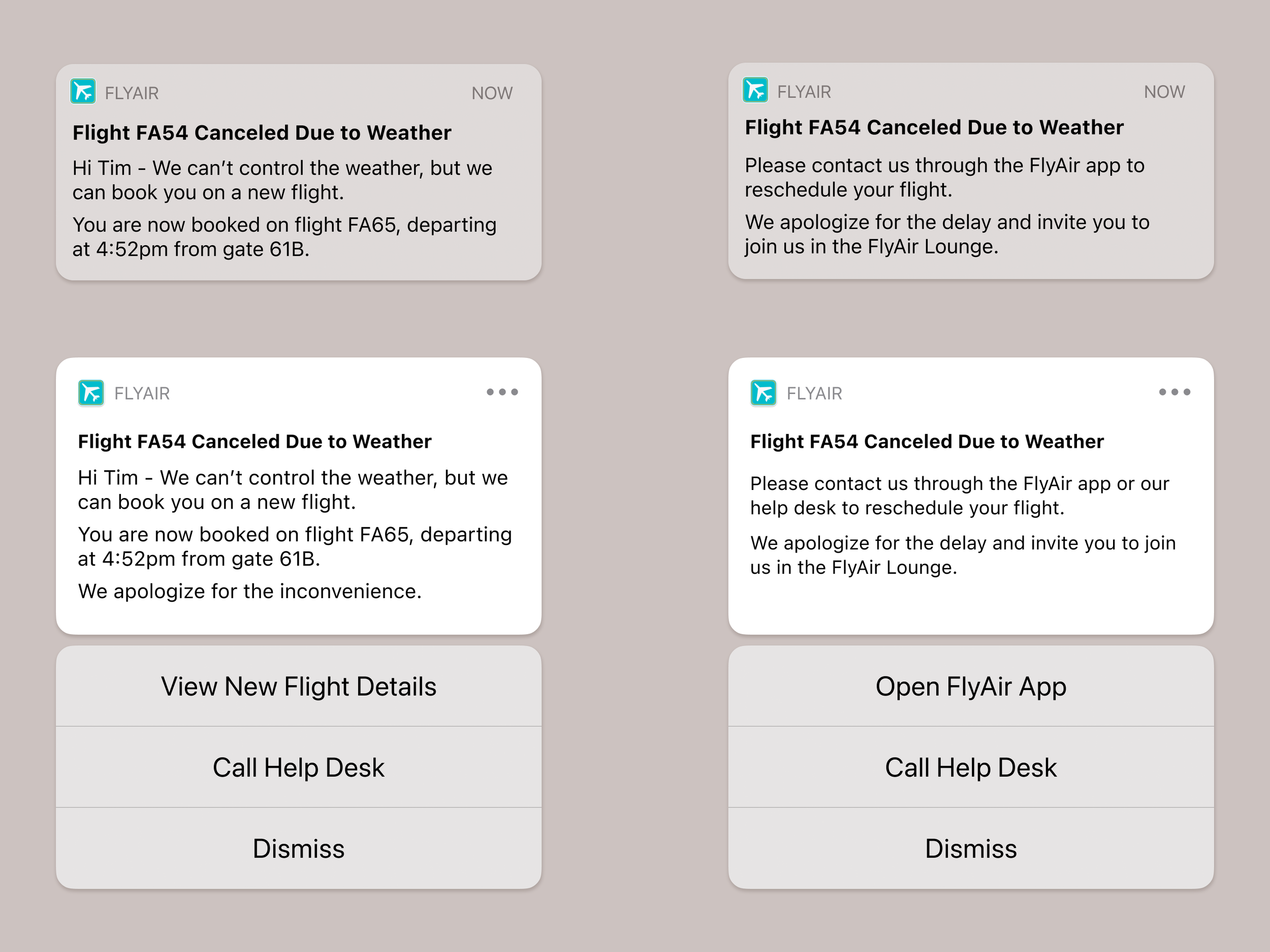
The airline can reschedule the passenger.
The airline is unable to quickly reschedule the passenger.
The airline can reschedule the passenger.
Collapsed
Headline: Flight FA54 Canceled Due to Weather
Body: Hi Tim - We can’t control the weather, but we can book you on a new flight. You are now booked on flight FA65, departing at 4:52pm from gate 61B.
Expanded
Headline: Flight FA54 Canceled Due to Weather
Body: Hi Tim - We can’t control the weather, but we can book you on a new flight. You are now booked on flight FA65, departing at 4:52pm from gate 61B. We apologize for the inconvenience.
Buttons: View New Flight Details / Call Help Desk / Close
The airline is unable to quickly reschedule the passenger.
Collapsed & Expanded
Headline: Flight FA54 Canceled Due to Weather
Body: Hi Tim - Please contact us through the FlyAir app to reschedule your flight. We apologize for the delay and invite you to join us in the FlyAir Lounge.
Visible on Expanded
Buttons: Open FlyAir App / Call Help Desk / Close


CHALLENGE 2
Promotion for Sports App
Scenario
A user is a working parent, and a big sports fan, in the midst of their favorite sports season who can no longer attend games.
Challenge
Write a promotional screen for an app that lets a user choose teams, sends game reminders, real-time score updates and highlight videos.
Headline: 40 characters max
Body: 175 characters max
Button(s): 25 characters max
Goal
A clearly written message, providing a simple solution to the user’s existing problem (missing out on their favorite teams’ games). The call to action should be the logical next step, making for a smooth conversion.
Considerations
Since the user is a busy working parent, the text needs to cut to the chase, simply stating the benefits and features of the app. The first few drafts included some wordplay, but I ultimately edited it down in favor of a clear and concise message. Even the call to action doesn’t mince words; instead of inviting users to learn more about the app, it takes them to the next step: choosing the teams they want to follow.
Suggested Solution
Headline: Be at the game, wherever you are
Body Text: Follow your favorite teams and receive game reminders, real-time score updates, and highlight videos.
Button: Find Your Teams

CHALLENGE 3
User Entered Wrong Email Address
Scenario
The user entered the wrong email address to sign in to their account.
Challenge
Tell the user to enter the right email.
40 characters max.
Goal
Give the user a clear understanding of the issue, avoiding confusion over why they cannot proceed.
Considerations
Initially, I approached this challenge by considering two interpretations of this scenario:
The user typed in an email address that is not tied to an account.
There was an error in the email address format.
I thought this might merit two different error messages, with the second scenario triggering a more specific message if, for instance, the user omitted an @ symbol. (And this would first need to be discussed with the development team to ensure they could identify these errors.)
However, I realized that the user could then also receive the first scenario message after fixing the email format if that address was not linked to an account. Two potentially different error messages for one field did not seem like a useful solution, so I considered a tooltip for an error in formatting. This option would be dependent on the development team’s ability to identify this kind of error.
I then considered the brand’s voice and tone and moved forward with a less formal brand in mind. While the message could be friendly, it would still need to be clear and informative. The 40 character limit is a bit of a constraint, since there is no room to offer instructions.
Suggested Solutions
For this ‘less formal’ brand, I opted for a more conversational tone and placed the message directly below the applicable field, helping the user identify the error.
Situation 1
Email not linked to account
Message: Hmm…we can’t find an account for this email address.
Situation 2
Formatting Error
Tooltip: Please include an @ symbol in your email address.

CHALLENGE 4
Promotional Pop-Up
Scenario
A user is in their favorite supermarket. They open the supermarket’s app on their phone to see what’s on sale and are greeted by a promotion.
Challenge
Write a promotional home screen for a subscription service that delivers groceries to the user once-a-month for a flat fee.
Headline: 45 characters max
Body: 175 characters max
Button(s): 25 characters max
Goal
Primary Goal: Present a solution (delivery) to a potential problem (having to shop at the store).
Secondary Goal: Create awareness for the service.
Considerations
The user is currently shopping and is likely focused on the task at hand - and not looking to sign up for a delivery program. However, if they are not enjoying the current task, learning about the home delivery option could be a welcome discovery.
If the user is in a rush, and cannot commit to the service at that moment, the secondary button should not be a final dismissal (ex. I Prefer to Shop In Person) or worse, shaming them - and lowering the brand’s image - with something like ‘I Prefer to Be Inconvenienced’.
Instead, ‘Maybe Later’ lets the user postpone their decision.
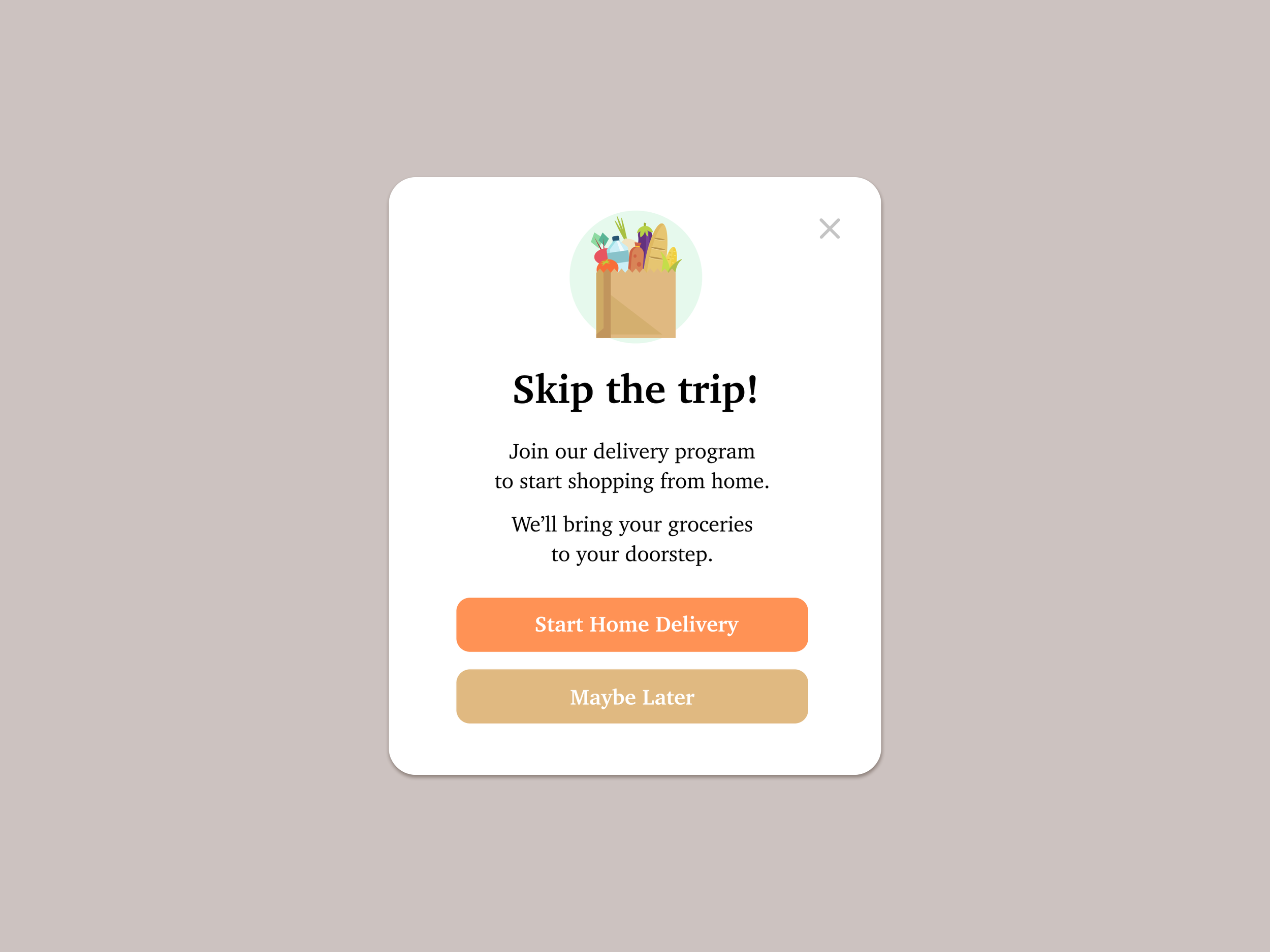
Suggested Solution
I opted against mentioning the monthly fee in the promotion text. The intention was not to deceive the user, but to limit the text to necessary information. The details will be provided if/when they learn more.
Headline: Skip the trip!
Body Text: Join our delivery program to start shopping from home. We’ll bring your groceries to your doorstep.
Buttons: Start Home Delivery / Maybe Later

CHALLENGE 5
Recovery Message
Scenario
The user works in graphic design. While critiquing a design in a mobile app, their phone abruptly turns off. When they restart the phone, they reopen the app.
Challenge
Write a message that the user will read immediately upon opening the app. What do they need to know? What steps (if any) do they need to take to recover their content? What if they can't recover the content?
Headline: 40 characters max
Body: 140 characters max
Button(s): 20 characters max
Goal
Tell the user what happened and what they can do about it.
While providing a reason for the error can strengthen trust between the company and user, it might not always be necessary for the next step. (However, if the problem was due to user error, an explanation can prevent future issues.)
Considerations
Regardless of who is responsible for the error, it is important not to blame the user or make them feel badly about the situation, especially if they are dealing with loss of data. In fact, the message should be supportive, in addition to helpful.
I offered two versions below: one where the user’s data can be recovered, and one where it cannot be recovered. Of course, the exact wording of the latter would depend on what the company is able to offer to the user.
For the first version, I had considered a secondary CTA with a link reading ‘Continue to app’, but thought it could be confuse the user if they saw it as another option to to recover their work. Instead I added an ‘x’ to close the window.
Suggested Solutions
Data can be recovered
Headline: Your work was automatically saved.
Body: An error caused our app to close during your last session, but our recovery feature saved your last 5 versions.
Button: Review Saved Work
Data cannot be recovered
Headline: When “we’re sorry” isn’t enough.
Body: An error caused our app to close and we couldn’t recover your unsaved work. Please accept a $5 account credit in addition to our apologies.
Button: Add Credit to Account

CHALLENGE 6
Potential Danger Alert
Scenario
It’s Monday. A user has just gotten into their car to drive to work. They plug their phone into the car and start driving.
Challenge
How would you let the user know there’s a fire happening in a nearby town that is causing road closures? The effect on their commute is unknown, but there is a definite danger if the fire gets closer. How do you communicate this to them? When? Write it.
Headline: 30 characters max
Body: 45 characters max
Goal
Make the user aware of the situation so they can react accordingly.
Considerations
While we need to get the user’s attention, I do not believe in being an alarmist. I think there is a way to communicate urgency without scaring someone.
When this is shown depends on who is sending the notification: A navigation app? A local government app? A fire department app?
Suggested Solution
Headline: Warning: Fire at Sepulveda Pass
Body: Stay safe and reroute if necessary.
If this alert is from a navigation app:
Buttons: Find New Route / Dismiss

CHALLENGE 7
Sports App Notification
Scenario
A sports fan is at a wedding while their favorite team is playing against their arch-rivals. Their team scores.
Challenge
How would you, quickly, let the sports fan know about the latest play, the current score, and the key players? Write it.
Headline: 30 characters max
Body: 45 characters max
Goal
Clearly show pertinent information so user can see those details at a glance.
Considerations
While I am not a die-hard sports fan, I know how important it is (to those fervent fans) to know what is happening the second it happens. Whether they need that update during a a wedding or during their commute home, both situations require the information to be delivered concisely - with the option to see more.
Suggested Solution
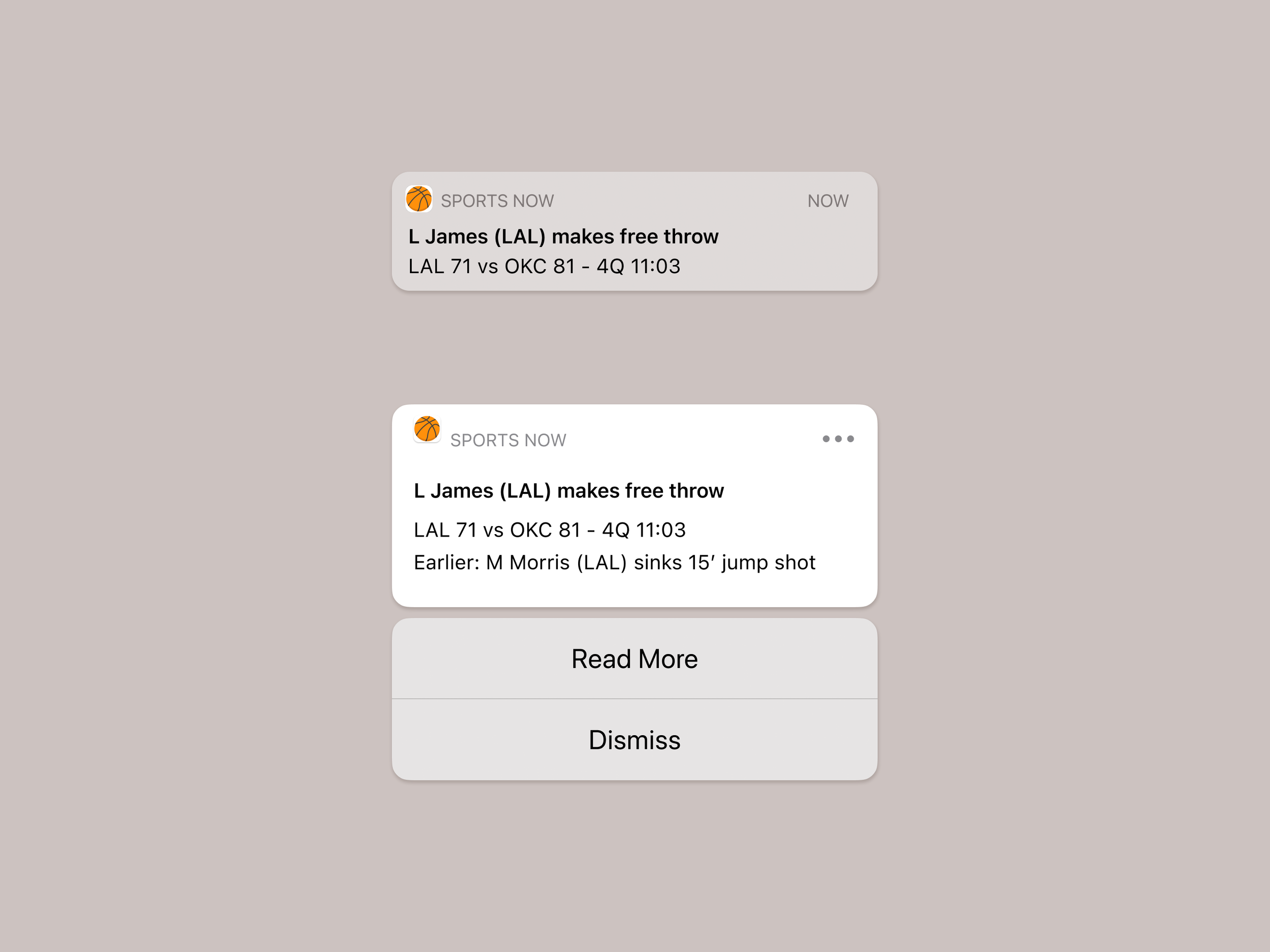
Collapsed
Headline: L James (LAL) makes free throw
Body: LAL 71 vs OKC 81 - 4Q 11:03
Expanded
Headline: L James (LAL) makes free throw
Body: LAL 71 vs OKC 81 - 4Q 11:03
Earlier: M Morris (LAL) sinks 15’ jump shotButtons: Read More / Dismiss

CHALLENGE 8
Music App Concert Notification
Scenario
The user is a casual music fan and (on occasion) goes to live concerts. They have a music player app on their phone.
Challenge
Tell the user that one of their favorite bands is playing live in their town. How would you compel them to want to go?
Headline: 30 characters max
Body: 45 characters max
Button: 25 characters
Goal
Provide the necessary details for the upcoming concert. Offer reasons why they should click through to buy tickets.
Considerations
The headline can provide the basic information: who is playing (to see if it is a performer/band they like) and where (to see if the show is nearby), and that should be communicated in the headline.
The body of the message can offer more detail and reasons to click through:
Exclusivity (“Early access”)
Urgency (“Starts now”)
Scarcity (“Limited number of tickets available”)
Suggested Solution
Collapsed
Headline: Tickets on sale: Usher at the Forum
Body: Early access for 9/7 show starts now!
Expanded
Headline: Tickets on sale: Usher at the Forum
Body: Early access for 9/7 show starts now! Limited number of tickets available.
Buttons: Get Tickets / Close

CHALLENGE 9
Expired Credit Card
Scenario
The user is trying to rent a car using an application but the credit card on file has expired.
Challenge
Write them an error message so that they can correct the problem.
Headline: 30 characters
Body: 45 characters
Goal
To alert the user to the situation (their saved credit card has expired) and how to remedy it (update the saved card or add a new payment method) so they can complete their reservation.
Considerations
The user has is already halfway through the process, and has committed to the reservation. Their goal is to complete the process.
The business (the car rental company) does not want to lose this reservation, especially now that the user has already selected their dates, location, and vehicle. An expired credit card is an obstacle, but not a dead end. Offering clear information and helpful instructions will help the user fix the issue and complete the reservation. It is important not to shame or scold the user, since that could cause the user to abandon the reservation (and perhaps not return).
While the message can let the user know that their credit card is no longer valid and offer clear directions to ‘update’ or ‘add a new payment method’, it is important that the design offers clear cues on how to make that update (the green EDIT) or add a payment method (the green button).
Suggested Solution
Instead of a headline and body text, there is just one message:
Message: Looks like your credit card expired. Please update or add a new payment method.

CHALLENGE 10
Request for Personal Information
Scenario
The user is trying to view a website to help them buy a car. But the content can’t load without the user’s location. They need to enter their ZIP code and first name.
Challenge
Ask them where they live and who they are without sounding like you're unnecessarily mining their data.
Headline: 25 characters
Body: 45 characters
Button: 15 characters
Goal
Explain why the requested information is required so the user feels comfortable moving forward.
Considerations
Users can be suspicious of sharing PII (personal identifiable information), and for good reason. If there is any distrust, they may abandon their search. To avoid this, it’s important to reassure the user by letting them know why the request is being made.
I had played around with using more text, including microcopy above each field, but opted to keep it simple. I ended up limiting the text to a headline that provides enough context for the requested information.
Suggested Solution
Headline: Personalize your visit and see local prices
Button: Browse Cars

CHALLENGE 11
Title and Meta Description for Search
Scenario
An elderly user is doing a Google search to find an easy way to buy contact lenses online.
Challenge
Write a title and meta description for a website that sells subscription contact lenses delivered to a user every 30 days—convince them to try it.
Title: 60 characters
Meta Description: 160 characters
Goal
Primary Goal: Appeal to users searching for contact lens delivery and sway them to click through to the site.
Secondary Goal: Include keywords for search engines.
Considerations
A quick Google search reveals that there are a number of similar services available, so in addition to including our keywords (contact lens, delivery, monthly, etc.) we need to tailor our message to our user, who is elderly. Instead of swaying them with a free trial or discount (which would need to be approved by other departments), the copy appeals to the problem of forgetting to order lenses each month. While this is something many contact lens wearers might experience, it is more common with the elderly.
To avoid unintentionally insulting our target user, we should do the following:
Keep the message general, as in “we all forget!”
Test the text
Suggested Solution
Title: Contact Lenses Delivered to You Every Month
Meta Description: MyMonthlyContacts ships your prescription contact lenses directly to your home. Receive new lenses every 30 days. Even if you forget, MyMonthlyContacts will remember!

CHALLENGE 12
Name Not Recognized in Form
Scenario
A user is creating an account. When they come to the step where they are asked to enter their name, they get an error message. A fraud detection software thinks their name is fake—but it’s wrong 5% of the time.
Challenge
Write an error message that prompts them to fix the error without shaming them for having a fake-sounding name.
Message: 45 characters
Goal
To alert the user to the issue without insulting them.
Considerations
This was a difficult challenge, especially with a 45 character limit. There is a lot of emotion tied to a person’s name, making it easy to be unintentionally insensitive with messaging.
After considering a number of different approaches, I chose a simple message.
I do think there could be a better solution, but it would require more time, research, and collaboration with others.

Suggested Solution
Message: Sorry, we don’t recognize that name.
CHALLENGE 13
Schedule Update
Scenario
A short-haul truck driver has a phone app that monitors his route, schedule, fuel & deliveries. He has 6 more deliveries before stopping for fuel and lunch. Due to unexpected traffic, he’s behind schedule.
He can choose to stay on his planned route for a few more stops, but risk running low on fuel and missing lunch, or he can get fuel and lunch now and finish the deliveries later.
Challenge
Write a push notification alerting him of this dilemma and options.
Headline: 30 characters
Body: 45 characters
Buttons: 25 characters
Goal
To explain the current situation and offer options.
Considerations
Without the benefit of research into the user’s workday, including their job’s expectations and restrictions, I kept to the basics. I opted to exclude extraneous information; in this case, the “unexpected traffic”, as the driver is likely already aware.
Suggested Solution
Collapsed
Headline: Break now for lunch and fuel?
Body: 6 deliveries left before break. Fuel may run low.
Expanded
Headline: Break now for lunch and fuel?
Body: 6 deliveries left before break. Fuel may run low. Break and finish deliveries later or stay on current route?
Buttons: Break Now / Stay on Route

CHALLENGE 14
Unknown Error
Scenario
A user is shopping using a price comparison app that boasts “real-time” pricing on items. As they are checking the price of an item, something goes wrong. The problem is unknown.
Challenge
Write a message that informs the user that they cannot access the app right now. You cannot specify "why" the app doesn't work, and you also want them to continue using the app.
Headline: 30 characters
Body: 120 characters
Button(s): 15 characters
Goal
Acknowledge the issue and reassure the user that everything is okay.
Considerations
Even though we can’t explain exactly what happened, we should offer a general reason that’s more personal than “things happen”. In this case, I thought it might be fun to play on the app’s feature of “real-time” pricing. Of course, this would depend on the voice of the brand and how they typically engage with their consumer. (For this challenge, I went with the assumption that the brand is not too serious and can be playful with their writing.) The user will appreciate an apology so they don’t think that they have done something wrong.
Since the user is in the middle of a “real'-time” pricing search, they are eager to return to this time-sensitive activity and will feel empowered by a recommended action to help remedy the situation. In an actual scenario, this would require input from the tech team; for now, I went with a “refresh” action.
Suggested Solution
Headline: Uh-oh, something went wrong.
Body: We’re sorry! Our real-time pricing finder can occasionally hit a real-time snag. Try refreshing the app to resume your search.
Button: Refresh app

CHALLENGE 15
Onboarding for Banking Bill Pay App
There were three options for this final challenge. I chose the following:
Write a multi-screen onboarding experience for a banking app that automatically pays a user's bills every month—as long as they set it up correctly.
Per screen:
Headline: 45 characters
Body: 100 characters
Button: 25 characters
Goal
Set expectations for what the user will need to do to set up their account. Show clear steps.
Considerations
Note: For this challenge, I made the assumption that this feature was offered from the user’s bank, so they already have an account with the bank and might already have set up a number of bill payees.
Since the app requires substantial setup from the user, it helps to set expectations. Since those expectations can overwhelm some users, it is beneficial to break them down into simple steps. Show the potential reward in the last screen offers the necessary motivation to continue with the actual setup!
Suggested Solution
Screen 1
Headline: Select Bills to Pay
Body: Choose from current bill payees or add new ones.
Button: Next
Screen 2
Headline: Choose Payment Dates
Body: Specify when each bill should be paid.
Button: Next
Screen 3
Headline: Receive Notifications
Body: Allow notifications to know when payments are scheduled and when they are sent.
Buttons: Notify Me / Not Now
Screen 4
Headline: Do Something Fun
Body: After setting up your bill payments, enjoy doing anything but thinking about your bills.
Button: Continue to Setup

Images for these projects were created using Figma and Photoshop.
Challenges 10, 14, and 15 featured images from Stories by Freepik.