Introduction
I received two emails from the California Franchise Tax Board (CA FTB), related to activity on their payment platform, MyFTB.
With the rapid rise of phishing scams, I am especially vigilant about emails from unknown senders, especially ones related to payments. I was immediately skeptical of the authenticity of these emails. Even after confirming that they were from the state, I was disappointed to find overly wordy and poorly organized emails, making it difficult to decipher which information was important.
As communication related to tax payments, neither email made me feel secure about my activity on the platform. And despite the inclusion of the state seal of California on one of the emails, there was little reassurance that these emails were coming from a state government agency.
The goal of these rewrites was to create email that:
are easily recognizable before opening
quickly establish trust
have a consistent and readable content pattern
efficiently convey key information
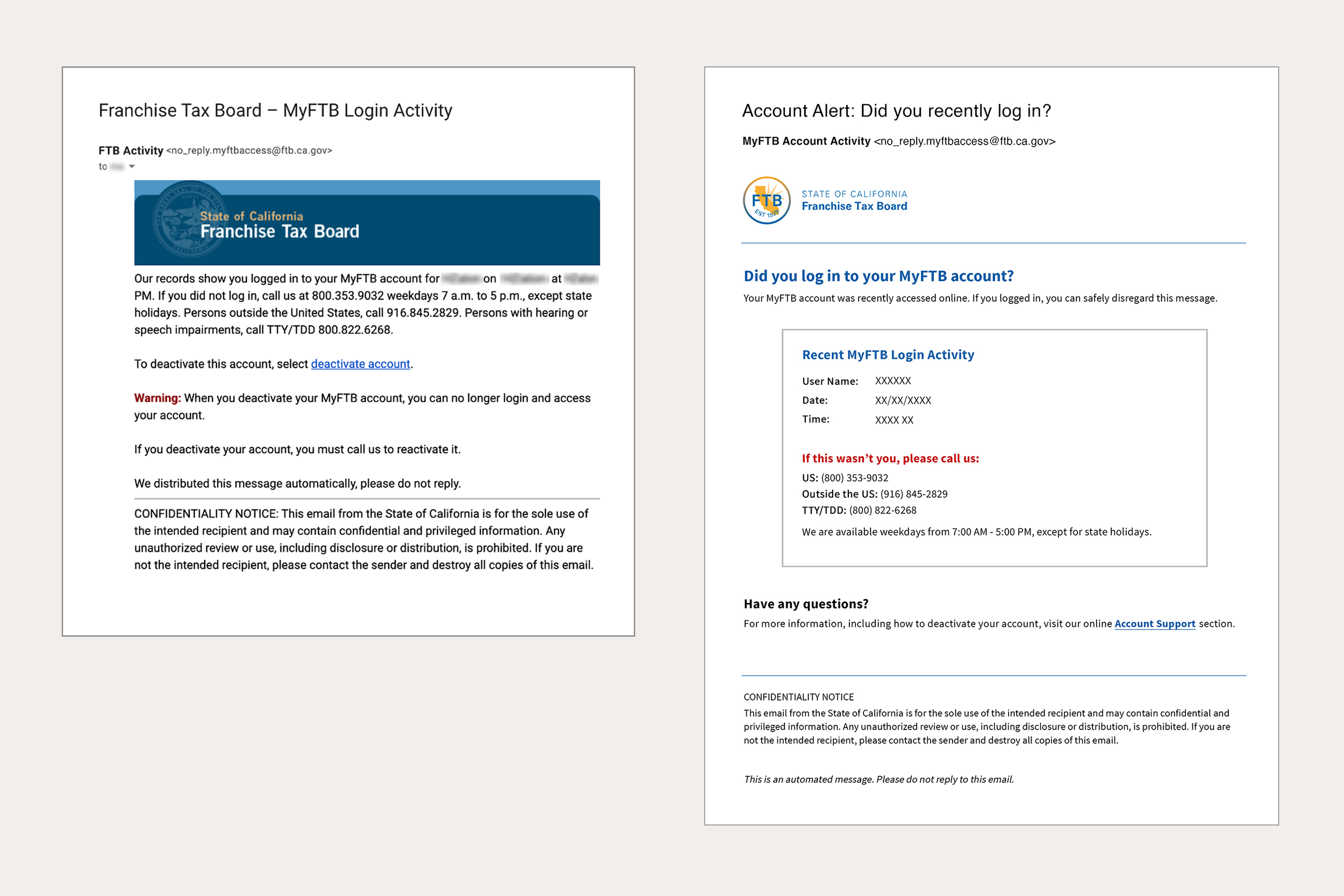
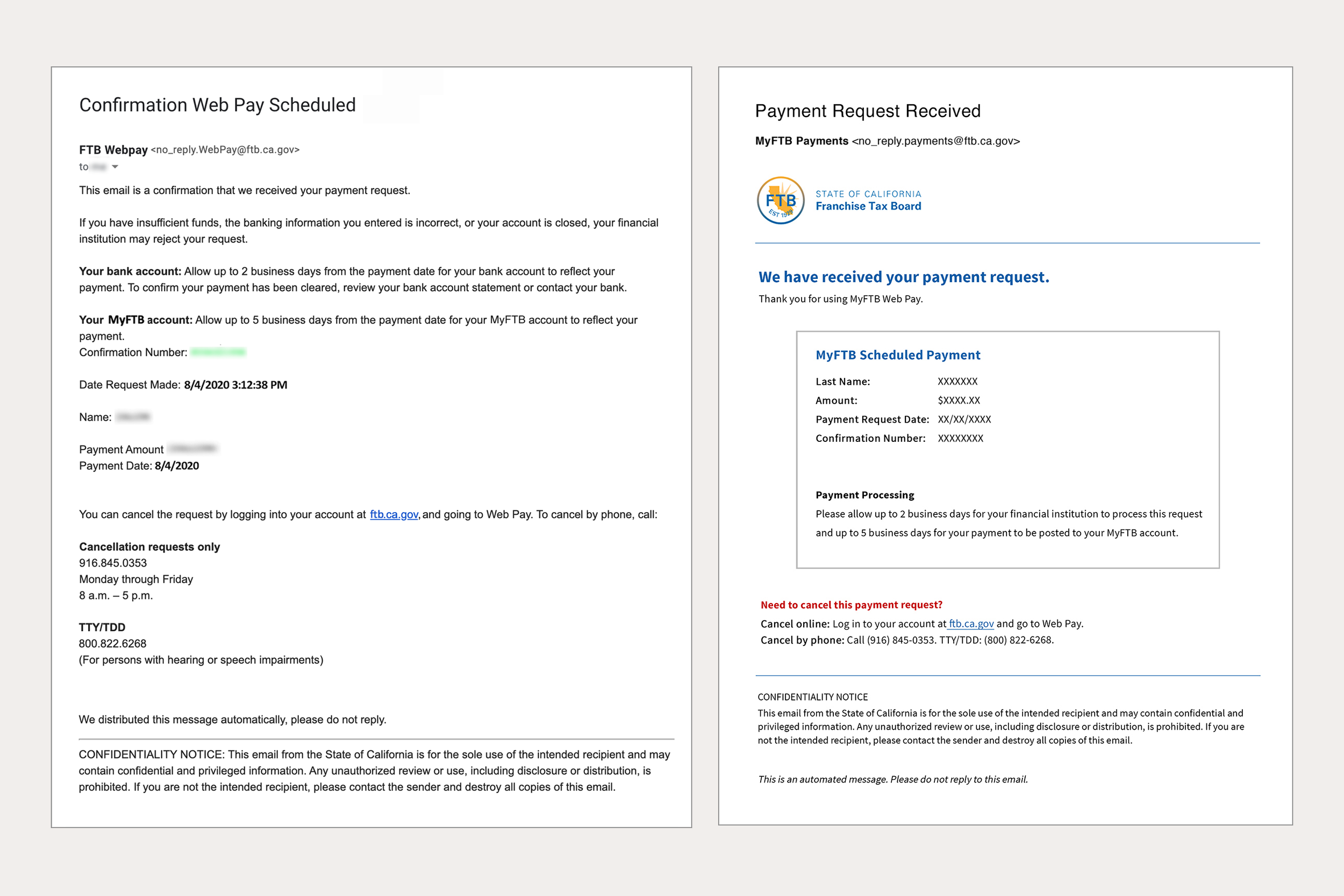
Original Emails


Considerations
I took both the user and context of the emails into consideration.
The User
Taxpayer in California who uses the state’s online payment platform.
MyFTB is available to taxpayers who prefer to make online payments. Since an account with the site is not a requirement, those who choose to create one are likely comfortable with online payments and communication.
Regardless of their comfort with technology, many people are anxious about taxes and the security of their personal and financial information. Related emails should be recognizable in their inbox, easy to read and understand, and contain content instills trust.
Context
Communication regarding state tax payments.
Because of the subject matter, these emails should convey the appropriate voice (authoritative yet approachable) and tone (serious without being overly formal, respectful of the user), while getting straight to the point with a direct call to action.
A recognizable content pattern would help with readability and building trust in the content.
Process
Research
I attempted to find data on California taxpayers to better understand the recipients of these emails. Unfortunately, I was unable to uncover specifics, so I referred to general best practices for email notifications to supplement my work on this project.
Notes
I made notes of areas that could be pain points or opportunities.
SUBJECT LINE should be more descriptive to stand out in a busy inbox.
“FROM” ADDRESS should be consistent across emails.
HEADER IMAGE should be smaller and in both emails.
CONTENT should have a clear information hierarchy, using varying text sizes and colors, and clear CTA buttons. By using an appropriate voice and tone, they could reassure users and build trust.


Implementing Changes
I then created new email templates with a consistent content pattern, reorganizing content in order of importance and removing extraneous copy (making some of it available via a link to the web site’s support section).


Intended Result
The modified emails should be easy to identify in the user’s inbox, provide readable communication and easy to recognize patterns, and instill confidence about the security of their tax payment activity. This should also have a positive impact on the level of trust in the state’s Franchise Tax Board and their online offerings.
Quick View: Before & After