
Introduction
After stumbling upon the error page for Hulu.com (Hulu) and seeing a basic black and white design, I thought the company was missing an opportunity to reinforce their messaging, increase trust in their brand, and connect with their customers - or prospective customers.
While I applaud simplicity, it is possible to offer a simple page that still delights users. As I researched other players in the space, I noted that most have achieved the simple-yet-delightful error page, and sought to create one for Hulu.
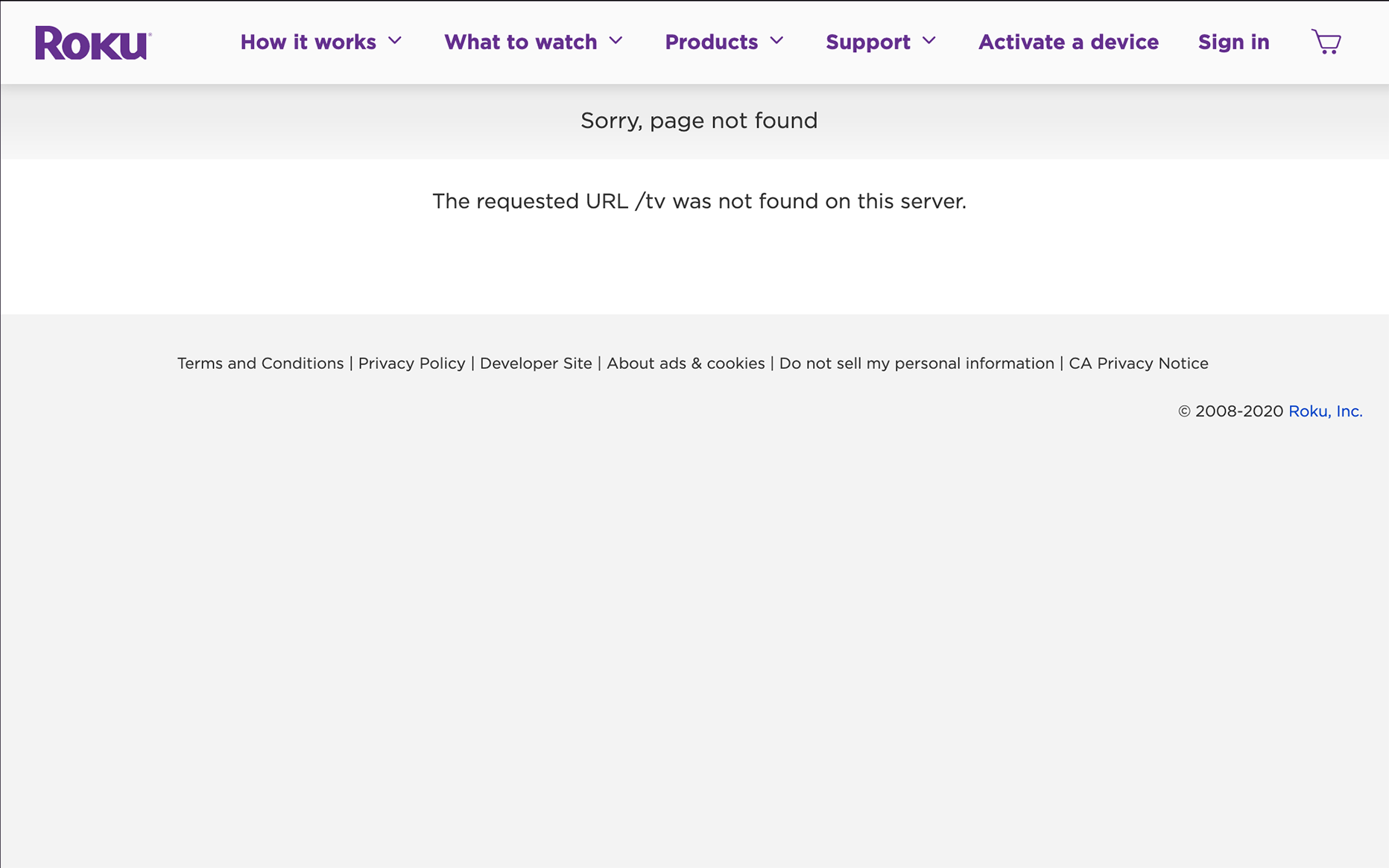
Current Hulu 404 Error Page
Logged in page shown. Public page differs slightly.

Considerations
An error page can be disappointing and break the momentum of a user’s visit. Instead of being a bump in the road, however, an error page can be an opportunity to keep the visitor engaged.
The visitor who lands Hulu’s error page has visited the site to either log into their account or learn more about the company. There is no free version of Hulu, so both types of visitors have expectations:
The paying customer expects an experience worthy of their monthly payment
The potential customer is seeking a reason to pay a monthly fee.
As s subscription service, the company should be treating all visitors as either current paying customers or potential paying customers. To that end, every page on the site should be proving that they are worth the monthly fee. The error page can also be used as a marketing vehicle to upsell the company by:
Displaying the brand’s personality.
Demonstrating usability. (A clear and practical error page suggests a clear and practical Hulu experience.)
Showcasing available content to paying customers.
This should be done while employing the brand’s voice and tone, as a consistent brand image contributes to user trust.
But it should stay simple, focusing on the shared goal of the visitor and the company: getting the visitor back on track.
Process
Competitive Research
I reviewed the following error pages from competing streaming services: Netflix, HBO Max, Disney+, Prime Video, and Roku, and Vudu.
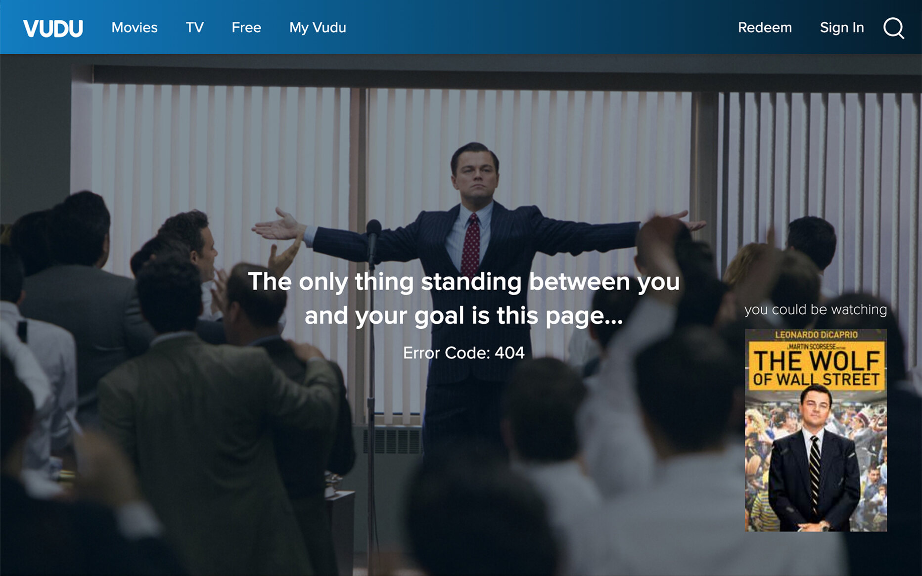
I was most impressed with Vudu’s error page.
It rotates between a number of movie scenes, each featuring a film quote that’s been modified to be about the error page, and a link to watch the featured movie. In addition to being on brand, it is entertaining and offers an unexpected surprise - an option to click through to a movie they might not have considered watching.
What is missing is a call to action below the error message. If the user doesn’t opt to watch the featured movie, they need to navigate to the top menu.
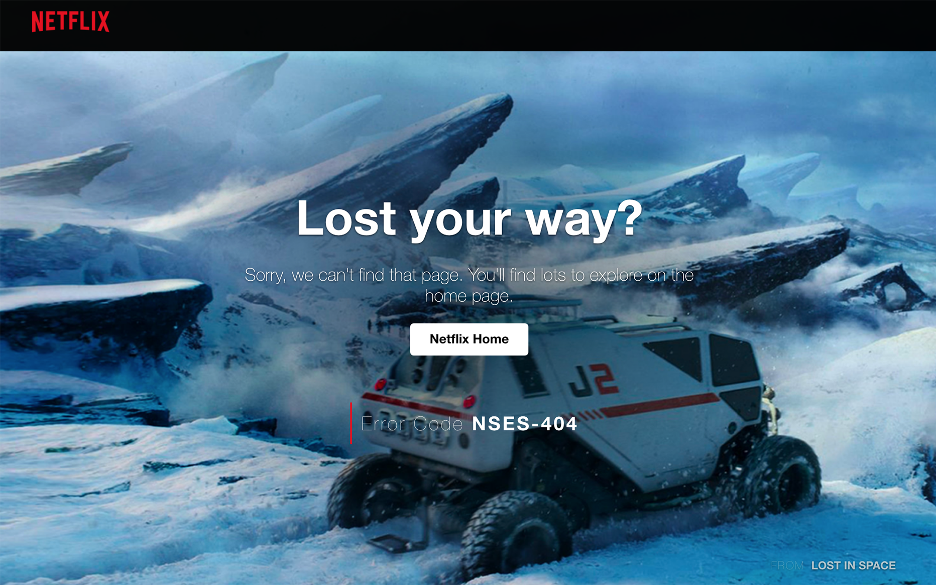
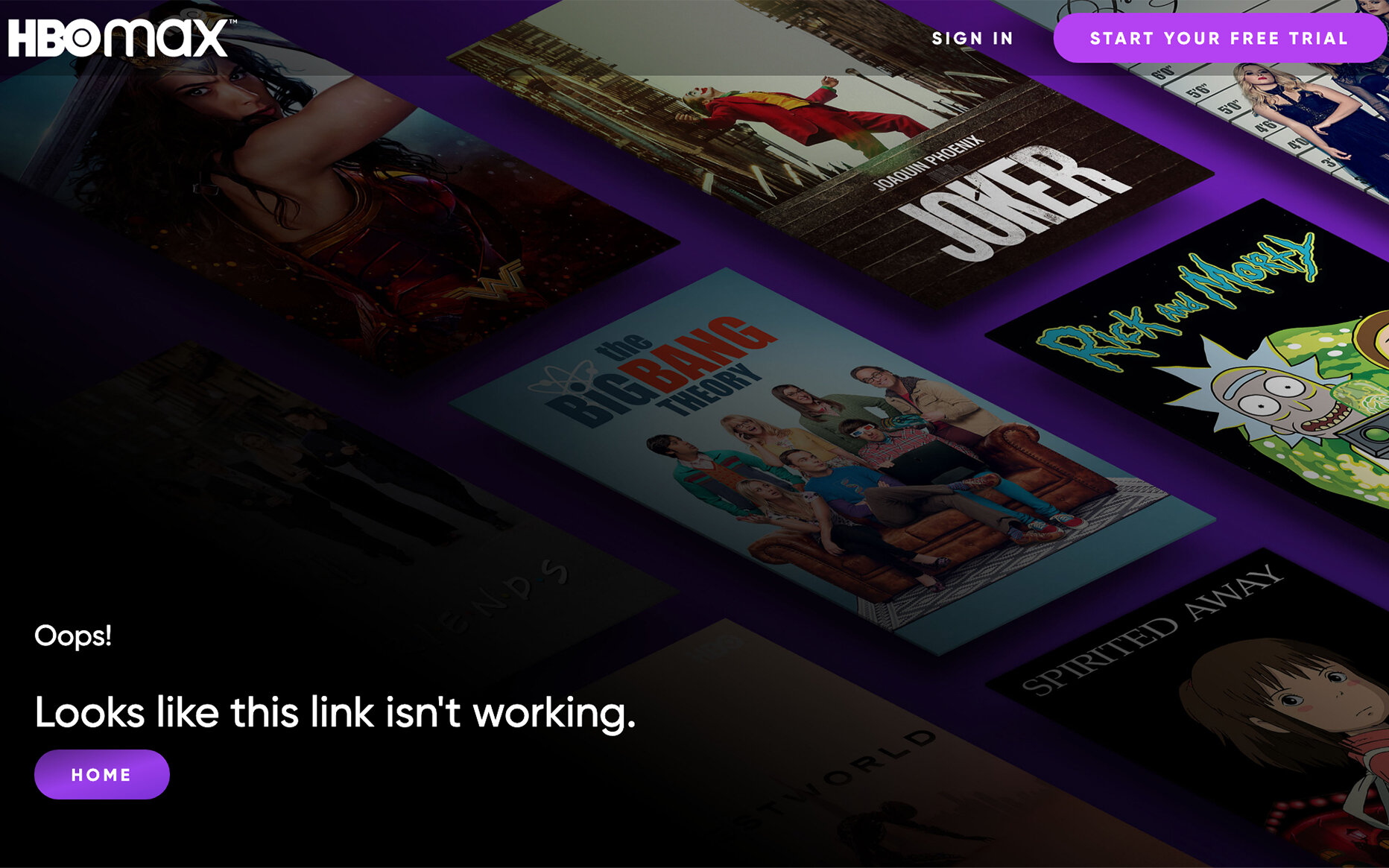
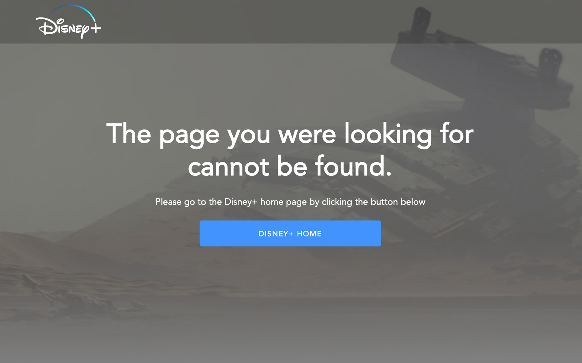
Disney+, Netflix, and HBO Max offer effective error pages, with varying degrees of impact. Each features imagery from content available on their platforms and offers a simple message with a CTA button to take users to the home page.
Prime Video and Roku rounded out the competitive review with uninspiring error pages.

Brand Research
Hulu uses minimal text across their website, but I was able to find a few hints about their brand’s voice and tone.


Notes
I made notes of areas that could be pain points or opportunities.
Current Headline: The page you’re looking for can’t be found.
This is an impersonal and generic line. The message should be more conversational and customized to the brand.
Button: Okay
What page would an “Okay” button lead to?
Imagery (None)
As an entertainment company, a plain gray (or white) page is a missed opportunity to engage the user. Instead, this page should feature images of the company’s offerings.
Footer
This area could include shortcuts to popular sections (via links), but should only be accessible farther down on the page, viewable if the user scrolls down. The decision to include a footer, which links to display, and how many links to include should be part of a discussion with the product and marketing departments.

Proposed New Error Page
While not drastically different from their current 404 error page(s), the revised Hulu error page reflects the brand’s voice and tone, offers some compelling imagery, and provides a clear CTA.

Headline: We can’t find the page you’re looking for.
Body: But we know you’ll find something great to watch on Hulu.
Button: Hulu Home Page
The modified page offers:
slightly more conversational tone
clean header with search option
footer only visible if user scrolls down
hint of available content*
clear call to action
*If this work had been done within a team, there would have been input from product and marketing about which content to feature.
Intended Result
Visitors who stumble onto the new Hulu error page should feel like they are still experiencing the Hulu brand, one that is worthy of a monthly subscription fee.
While the new text and design pattern (text with a CTA button) is similar what currently appears on the error page, the tone is more conversational and the added line of text and imagery ties the message back to Hulu’s core offering.

